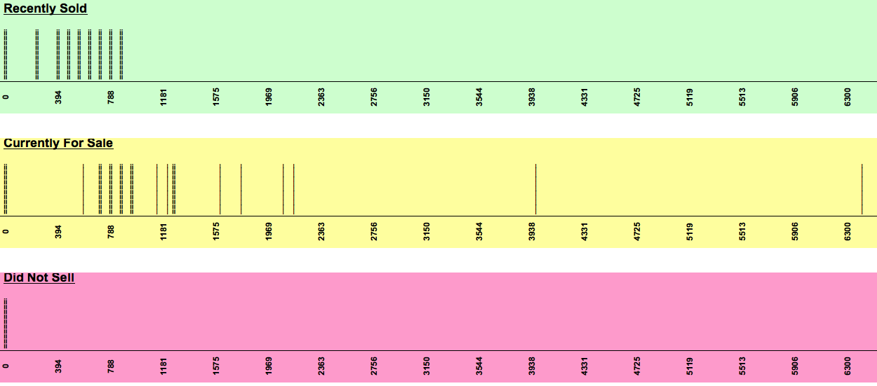
 This chart is useful to see the market at once glance. The green section shows a tight distribution of where things are selling (<$850,000).
The yellow section shows what is currently for sale. A fair amount is above the $850,000 and probably the reason it is more than likely not sold.
The pink section is for what has not sold, but nothing in there.
Leave a Reply